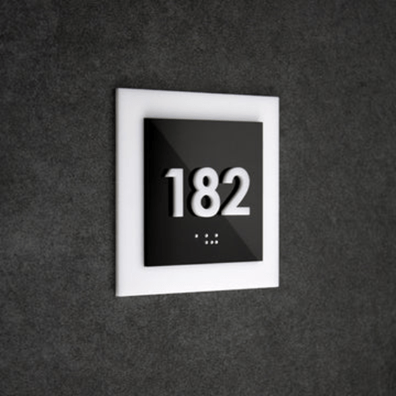
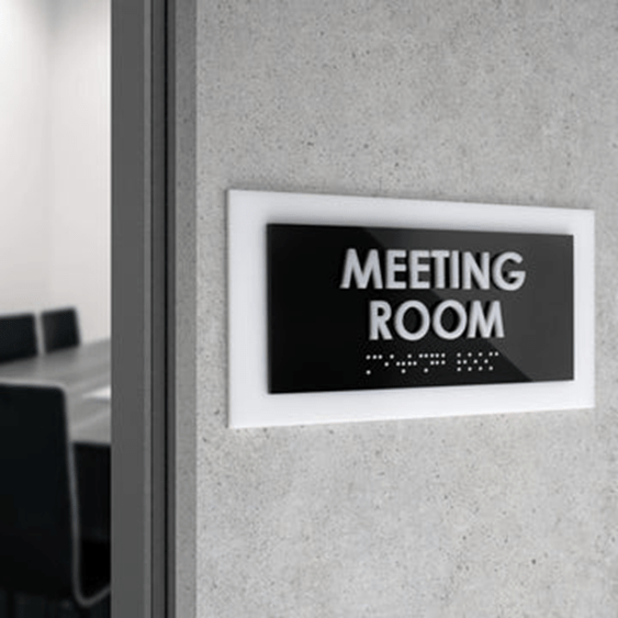
The significance of the wayfinding system that corresponds to the orders imposed by the ADA paper cannot be underestimated or overlooked. These simple yet effective tools guarantee that every visitor can enjoy the same privilege of accessing certain spaces in spite of their physical disabilities. That is why everyone should be aware of at least the basic rules, and that’s why we prepared this short review of the most necessary things.

But before you start discovering all the key aspects of ADA standards for door and wall signage, take note that the requirements displayed below are relevant to public spaces. So, if you run a store, hotel, restaurant, café, office building, dorm, etc., you should pay special attention to these rules. Also, you should know where you can get the best ADA room signs — Bsign store is where all the quality and antidiscrimination standards are met to a complete extent.
Necessary in Permanent Areas
Although all public spaces have to adhere to the ADA standard, it’s important to specify that not all areas must be marked with ADA-compliant door signs. The major purpose of door signage is to ensure proper navigation, and ADA features help people with disabilities. However, this is not mandatory when the area is temporary but not a permanent one. By permanent areas, we mean elevators, restrooms/bathrooms, receptions, staff rooms, staircases, entry/exit points, etc. These places should have ADA-compliant signs because they play a crucial role in general wayfinding.
As for other premises, like conference rooms, kitchens, or personal offices, they might be used for other purposes as well. That’s the reason they aren’t considered permanent and shouldn’t be marked by ADA signs. Nevertheless, if you want to ensure the best wayfinding experience for all visitors, we suggest using ADA signs for all premises, regardless of their current functions.
Requirements for Design

Door and wall signs play an important role in the interior design. If you want to enhance the unique style of your space, the important task is not to get too far in this. You still have to ensure that door signs meet some visual criteria:
- Contrast colors: Individuals with visual impairments should be able to distinguish the lettering from the background plaques. That’s why the ADA requires that they should be made in contrasting colors.
- Raised characters: Characters on the ADA signs should be made so that they can be read in a tactile manner. ADA suggests that characters should be several inches raised from the background plate.
- Only necessary information: ADA signs shouldn’t confuse individuals in any way. That’s why if you want to add some more information, it’s better to use an extra sign. The major sign should display everything clearly and non-redundantly.
What About Fonts?
A font is an important part of ADA when it comes to door sign standards. It says that the fonts should be simple and easy to comprehend. While adding extra elements in Braille fonts isn’t mandatory, we suggest that you should consider this option as well. Writing in Braille will make signage understandable even for individuals with complete vision loss, ensuring maximum inclusivity in your space.


